Open to work
Creating a semantic colour palette to prepare an expanding design system.
Three opportunities had the potential to make a relatively simple design system much more complex; the prospect of a white-labelled variant of our product, a brand refresh and supporting dark mode.
I recognised the threat of a fragmented system, creating and building support for a semantic colour naming system.


Role
Product designer
Results
High confidence among engineers, product and commercial that we could deliver a white-labelled product.
An effective colour system that took the guessing out of the UI design process
Context
By Miles is a pay-by-mile car insurance provider that uses journey data to price based on how far members drive.
When I joined, a simple design system had been created as part of the ‘Product Language’, which had been rolled out the checkout. During my time there, I rolled this out to the full quote flow, a couple of partnership widgets and the mobile app to ensure consistency and make everything easier to maintain at a high standard.
The problem
Two new company goals had been prioritised; be ready to white label our entire product, prepare our design system and UI for a brand refresh, and we wanted to add the capability for dark mode – a commonly requested feature by our members.
I recognised early on that these posed a risk to the integrity and complexity of our product touchpoints:
- White-labelling: A commercial opportunity created the potential for thousands of styles overrides so that multiple parts of our product could be branded.
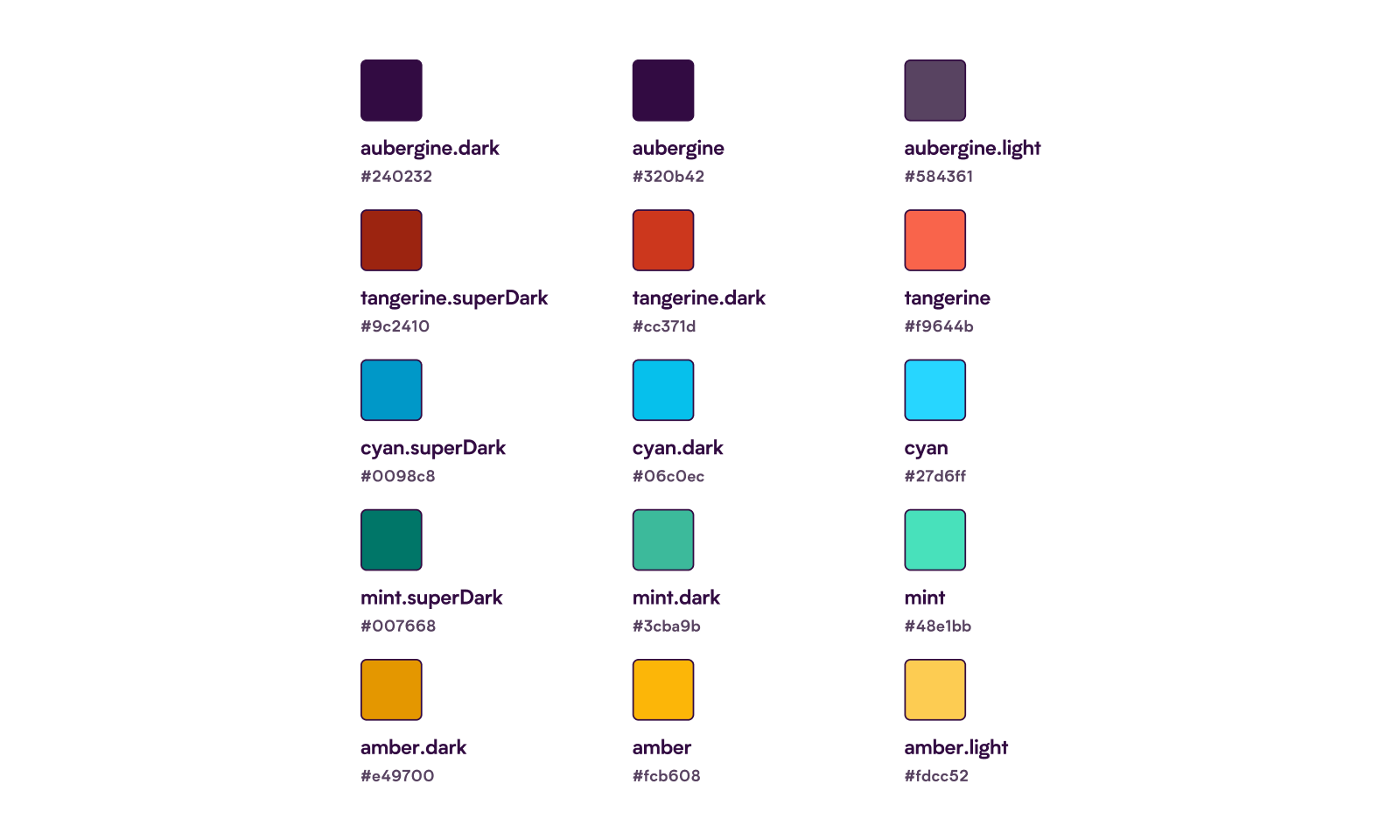
- Brand refresh: Our existing Product Language referenced brand colours such as ‘tangerine’ and ‘cyan’ rather than semantic colours based on their usage.
- Dark mode: Switching colours based on device mode or preference would require overrides anywhere a colour is used.
Because colours were named based on their appearance or brand reference, I needed to develop a system that allowed the switching of colours without requiring thousands of manual overrides for each brand and mode. I also needed to raise awareness of the scale of the problem and work with the engineers to solve this in a way that would lead to high adoption and easy maintenance.
The existing Product Language relied on a brand palette, meaning any reference would need to change wherever it was used. This created the potential for fragmentation and complexity.
My approach
Having worked with theming and white labelling extensively in my role at CENTURY, I knew the pitfalls and potential for complexity they could bring. I raised the need for a semantic colour naming system as the biggest challenge for delivering on the company goals for the quarter.
This concept wasn’t widely understood across the team that would be responsible for delivering it. Therefore, to ensure successful adoption and gather input, I put together a presentation to illustrate the purpose of an abstract set of colours as part of my proposal.
Creating the palette
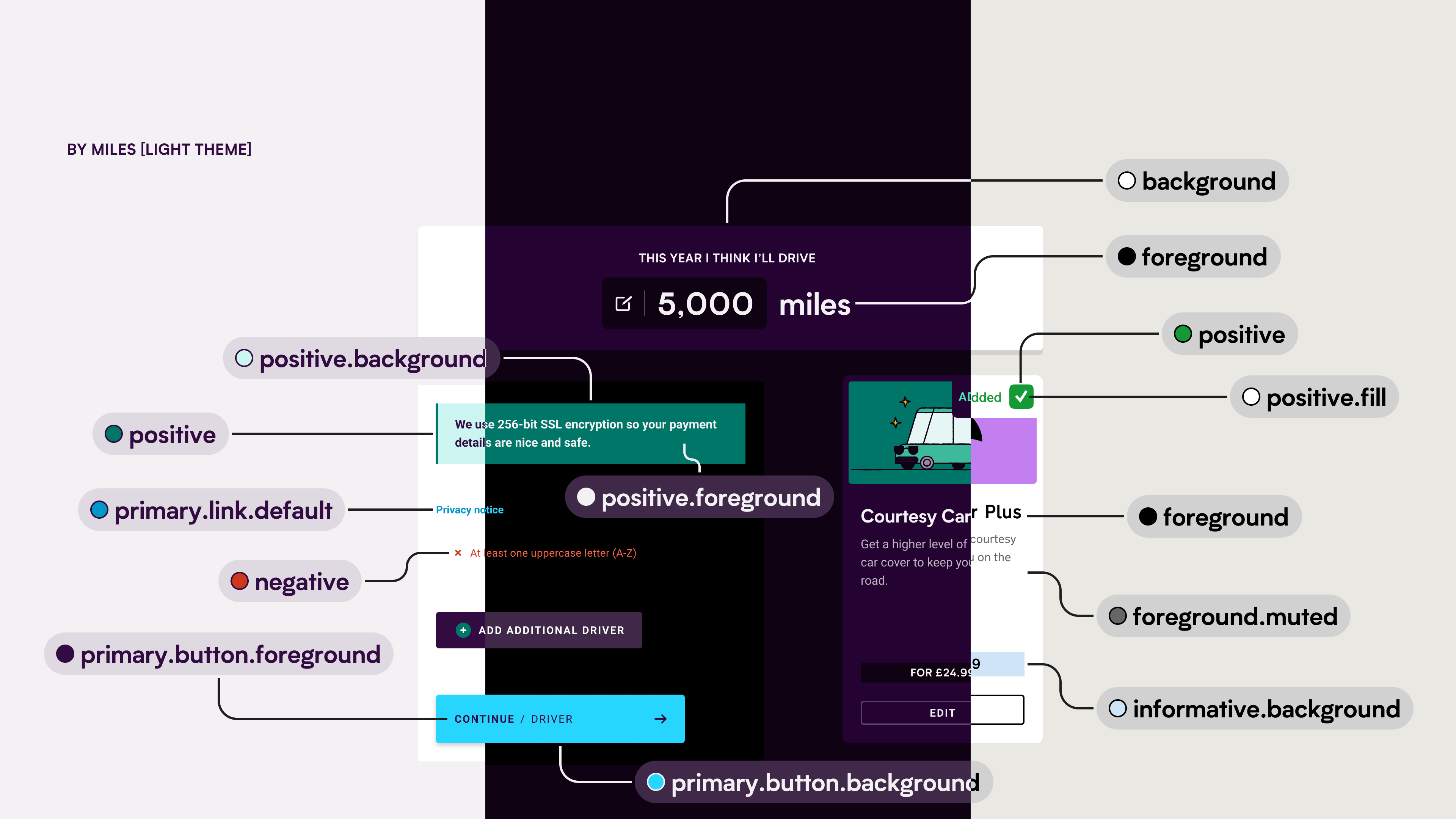
I audited the existing usage of colour across key product touchpoints, which informed a plain language system of colour that could adapt to the needs of the UI and its state.
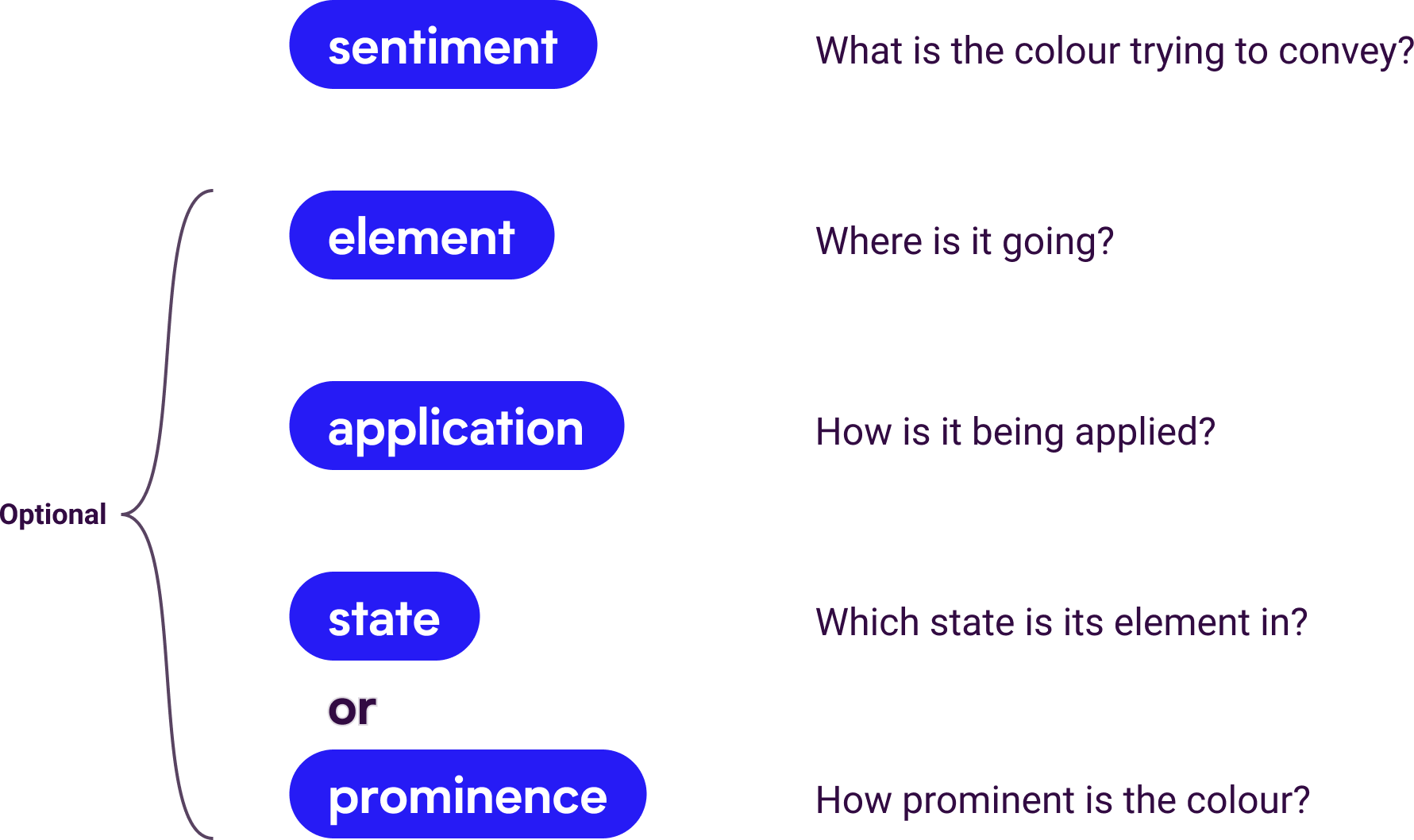
The taxonomy that best supported this was a maximum of four keywords; sentiment, element, application, and state or prominence.
I applied these ‘tokens’ to a few existing components from our checkout to ensure they worked in practice and made sense to designers and engineers.
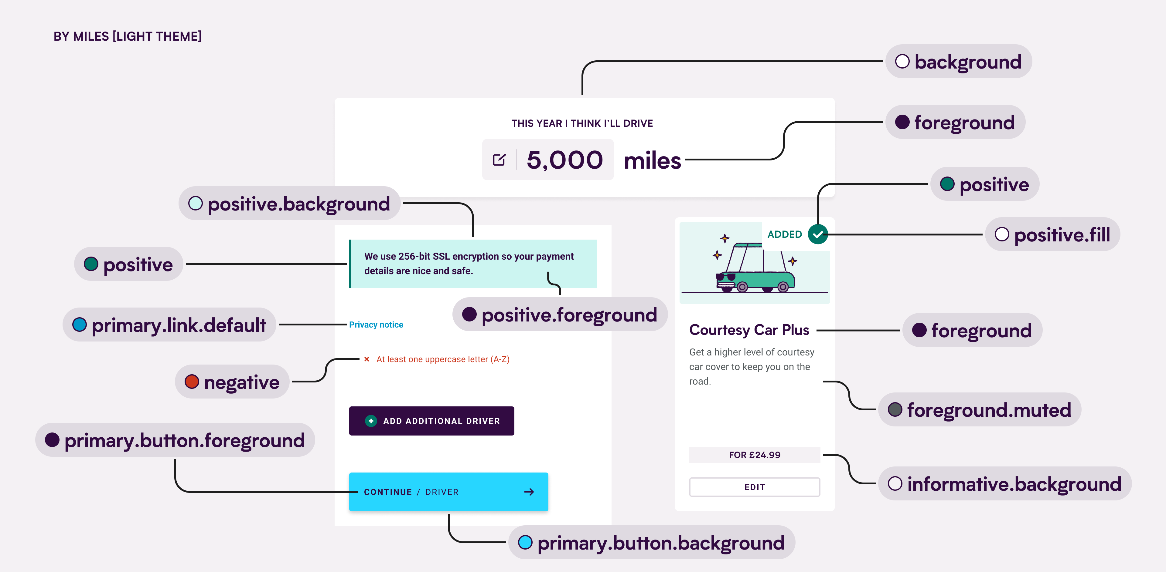
A clear, plain language system that allows colours to reference different brand values, depending on the theme and mode, defined at a higher level.
Building understanding and getting buy-in
This concept wasn’t widely understood across the team that would be responsible for delivering this work. Therefore, to ensure successful adoption and gather input, I delivered a presentation to illustrate the purpose of an abstract set of colours as part of my proposal.
The impact
By demonstrating the need for the system, how it would be applied and how it would work, the engineers had a clear understanding of the scope and requirements to begin rolling this out to the Product Language and the interfaces that relied on on it.
The proof of concept delivered by the engineers gave the company a high level of confidence in a crucial commercial opportunity.
It was also rolled out during the app navigation and home screen redesign, improving efficiency in both the UI design – where decisions about which colours should be used were significantly reduced, and development stages – where there were fewer variants and states within components.
© 2025 - 2026 Daniel van der Spuy
Get in touch:
hi@danvan.design
Connect with me on
Open to work
Creating a semantic colour palette to prepare an expanding design system.
Three opportunities had the potential to make a relatively simple design system much more complex; the prospect of a white-labelled variant of our product, a brand refresh and supporting dark mode.
I recognised the threat of a fragmented system, creating and building support for a semantic colour naming system.
Role
Product designer
Results
High confidence among engineers, product and commercial that we could deliver a white-labelled product.
An effective colour system that took the guessing out of the UI design process
Context
By Miles is a pay-by-mile car insurance provider that uses journey data to price based on how far members drive.
When I joined, a simple design system had been created as part of the ‘Product Language’, which had been rolled out the checkout. During my time there, I rolled this out to the full quote flow, a couple of partnership widgets and the mobile app to ensure consistency and make everything easier to maintain at a high standard.
The problem
Two new company goals had been prioritised; be ready to white label our entire product, prepare our design system and UI for a brand refresh, and we wanted to add the capability for dark mode – a commonly requested feature by our members.
I recognised early on that these posed a risk to the integrity and complexity of our product touchpoints:
- White-labelling: A commercial opportunity created the potential for thousands of styles overrides so that multiple parts of our product could be branded.
- Brand refresh: Our existing Product Language referenced brand colours such as ‘tangerine’ and ‘cyan’ rather than semantic colours based on their usage.
- Dark mode: Switching colours based on device mode or preference would require overrides anywhere a colour is used.
Because colours were named based on their appearance or brand reference, I needed to develop a system that allowed the switching of colours without requiring thousands of manual overrides for each brand and mode. I also needed to raise awareness of the scale of the problem and work with the engineers to solve this in a way that would lead to high adoption and easy maintenance.
The existing Product Language relied on a brand palette, meaning any reference would need to change wherever it was used. This created the potential for fragmentation and complexity.
My approach
Having worked with theming and white labelling extensively in my role at CENTURY, I knew the pitfalls and potential for complexity they could bring. I raised the need for a semantic colour naming system as the biggest challenge for delivering on the company goals for the quarter.
Creating the palette
I audited the existing usage of colour across key product touchpoints, which informed a plain language system of colour that could adapt to the needs of the UI and its state.
The taxonomy that best supported this was a maximum of four keywords; sentiment, element, application, and state or prominence.
I applied these ‘tokens’ to a few existing components from our checkout to ensure they worked in practice and made sense to designers and engineers.
A clear, plain language system that allows colours to reference different brand values, depending on the theme and mode, defined at a higher level.
Building understanding and getting buy-in
This concept wasn’t widely understood across the team that would be responsible for delivering this work. Therefore, to ensure successful adoption and gather input, I delivered a presentation to illustrate the purpose of an abstract set of colours as part of my proposal.
The impact
By demonstrating the need for the system, how it would be applied and how it would work, the engineers had a clear understanding of the scope and requirements to begin rolling this out to the Product Language and the interfaces that relied on on it.
The proof of concept delivered by the engineers gave the company a high level of confidence in a crucial commercial opportunity.
It was also rolled out during the app navigation and home screen redesign, improving efficiency in both the UI design – where decisions about which colours should be used were significantly reduced, and development stages – where there were fewer variants and states within components.
© 2025 - 2026 Daniel van der Spuy
Get in touch:
hi@danvan.design
Connect with me on
Open to work
Role
Product designer
Results
High confidence among engineers, product and commercial that we could deliver a white-labelled product.
An effective colour system that took the guessing out of the UI design process
Creating a semantic colour palette to prepare an expanding design system.
Three opportunities had the potential to make a relatively simple design system much more complex; the prospect of a white-labelled variant of our product, a brand refresh and supporting dark mode.
I recognised the threat of a fragmented system, creating and building support for a semantic colour naming system.
Context
By Miles is a pay-by-mile car insurance provider that uses journey data to price based on how far members drive.
When I joined, a simple design system had been created as part of the ‘Product Language’, which had been rolled out the checkout. During my time there, I rolled this out to the full quote flow, a couple of partnership widgets and the mobile app to ensure consistency and make everything easier to maintain at a high standard.
The problem
Two new company goals had been prioritised; be ready to white label our entire product, prepare our design system and UI for a brand refresh, and we wanted to add the capability for dark mode – a commonly requested feature by our members.
I recognised early on that these posed a risk to the integrity and complexity of our product touchpoints:
- White-labelling: A commercial opportunity created the potential for thousands of styles overrides so that multiple parts of our product could be branded.
- Brand refresh: Our existing Product Language referenced brand colours such as ‘tangerine’ and ‘cyan’ rather than semantic colours based on their usage.
- Dark mode: Switching colours based on device mode or preference would require overrides anywhere a colour is used.
Because colours were named based on their appearance or brand reference, I needed to develop a system that allowed the switching of colours without requiring thousands of manual overrides for each brand and mode. I also needed to raise awareness of the scale of the problem and work with the engineers to solve this in a way that would lead to high adoption and easy maintenance.
The existing Product Language relied on a brand palette, meaning any reference would need to change wherever it was used. This created the potential for fragmentation and complexity.
My approach
Having worked with theming and white labelling extensively in my role at CENTURY, I knew the pitfalls and potential for complexity they could bring. I raised the need for a semantic colour naming system as the biggest challenge for delivering on the company goals for the quarter.
Creating the palette
I audited the existing usage of colour across key product touchpoints, which informed a plain language system of colour that could adapt to the needs of the UI and its state.
The taxonomy that best supported this was a maximum of four keywords; sentiment, element, application, and state or prominence.
I applied these ‘tokens’ to a few existing components from our checkout to ensure they worked in practice and made sense to designers and engineers.
A clear, plain language system that allows colours to reference different brand values, depending on the theme and mode, defined at a higher level.
Building understanding and getting buy-in
This concept wasn’t widely understood across the team that would be responsible for delivering this work. Therefore, to ensure successful adoption and gather input, I delivered a presentation to illustrate the purpose of an abstract set of colours as part of my proposal.
The impact
By demonstrating the need for the system, how it would be applied and how it would work, the engineers had a clear understanding of the scope and requirements to begin rolling this out to the Product Language and the interfaces that relied on on it.
The proof of concept delivered by the engineers gave the company a high level of confidence in a crucial commercial opportunity.
It was also rolled out during the app navigation and home screen redesign, improving efficiency in both the UI design – where decisions about which colours should be used were significantly reduced, and development stages – where there were fewer variants and states within components.
© 2025 - 2026 Daniel van der Spuy
Get in touch:
hi@danvan.design
Connect with me on