
Open to work


Dreaming up and delivering an effective app engagement strategy.
High initial app engagement was dropping off after members’ first policy month, leaving value-add features underutilised.
I led a phased rollout that prioritised improving the discovery of existing features, then presented a "North Star" concept to align stakeholders. This created a modular "canvas" that empowered Brand and Marketing teams to test their own engagement hypotheses.
Role
Product designer
Results
+375% increase in app feature usage
Piloted our first app A/B test
Redesigned the home screen to as a canvas for cross-functional experimentation
Context
By Miles is a pay-by-mile car insurance provider that uses journey data to price based on how far members drive.
Aside from a fairer pricing model, they believe that offering helpful driving tools – powered by the same device that measures member mileage – and content around safer driving, saving money etc. would lead to engaged members who are less likely to claim and more likely to renew and refer others.
The problem
While we had high member engagement, our data showed that member engagement was heavily front-loaded. Once the "magic" of seeing the first few journeys wore off, users rarely returned to the app.
In addition to this decay in engagement, the following things needed addressing:
- Navigational friction: Features were buried in an inaccessible hamburger menu and layers of navigation.
- Design debt: The UI was fragmented and rigid. The engineers struggled to implement timely messaging or new features because the home screen was "hard-coded" for one specific purpose.
- Culture of assumptions: Many stakeholders had great ideas to help members drive safely, less frequently and upskill with driving tips (incentives, nudges, content), but we lacked the A/B testing framework to validate them.
In order to bring some of this to life and validate our assumptions of what members wanted, we needed a strategy.
Digging deeper
I partnered with the Product Manager and Data Team to audit our current state. We needed to understand where the “dead ends” were in our member journey.
The findings:
- Outside of admin tasks, the Timeline (Home) and Statements were the only screens with significant traffic.
- While stakeholders wanted more features, only 4% of users were interacting with the ones we already had.
Before building new features, we needed to fix the discoverability of our existing ones.
The solution
I agreed a phased design strategy with the team, focusing on a modular app template concept – designed to meet member needs while providing Brand & Experience with a canvas for engagement.
Phase 1: Fix the foundation
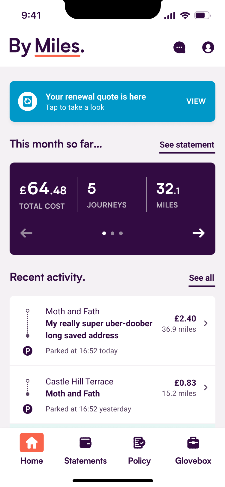
We replaced the inaccessible “hamburger” menu with a modern tab bar. I proposed using this as our A/B testing pilot to validate our experimentation tooling.
Control – All of the app’s navigation, concealed in a difficult to reach hamburger menu.
Variant – tab navigation along the bottom with less frequently-used features placed in the header.
Phase 2: The modular home screen
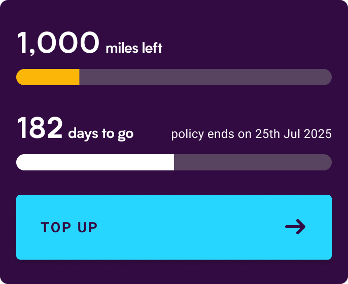
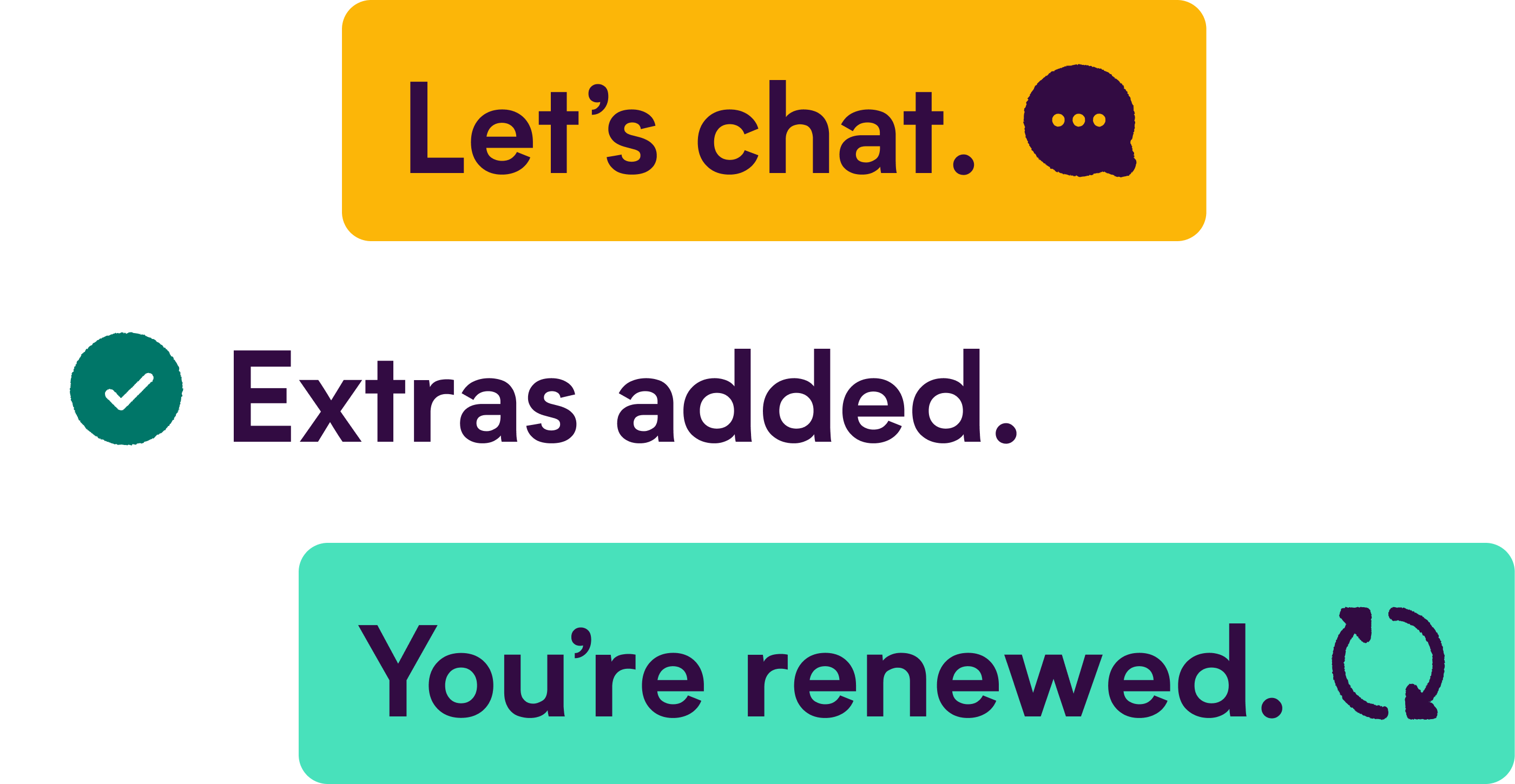
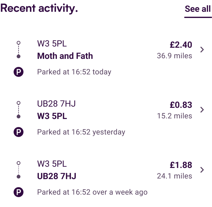
I designed a modular, section-based UI. This allowed the app to “breathe”, surfacing relevant information depending on the member’s policy state and offering a way to introduce personalised insights and content.
The re-imagined home screen that replaced the fixed-purpose timeline. accommodates all possible policy variants & states, and future personalisation/experimentation.
Phase 3: Empower the team
To get everyone excited about the path forward, I presented a vision that reimagined the app as a flexible sandbox rather than a static tool. This gave teams a visual playground to start dreaming: Marketing finally saw a home for their brand stories, and Engineering saw a scalable framework that wouldn’t break with every new request.
The impact
By validating our designs through usability testing and a phased A/B test rollout, we achieved significant lifts in both engagement and member sentiment.
- The tab navigation experiment was initially rolled out to 50% of our member base and saw a +125% increase in feature engagement. After rolling this out to everyone, we saw a +375% increase (total).
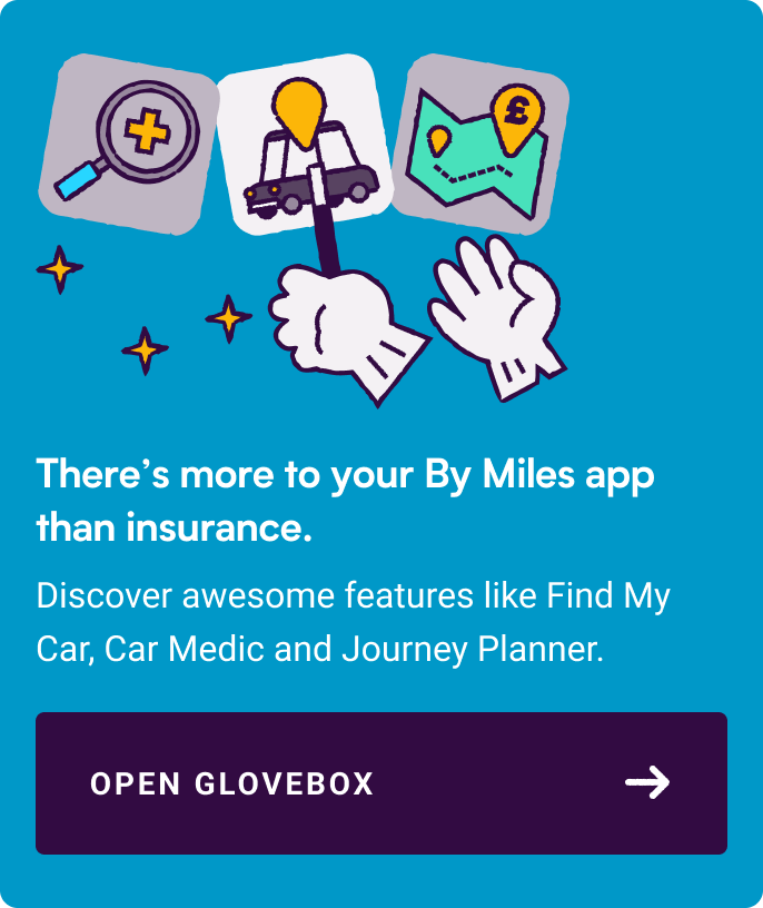
- The new home screen design led to further increases in Glovebox feature engagement.
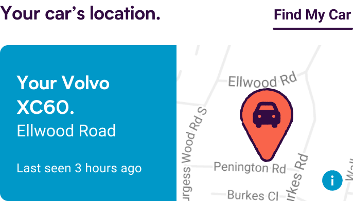
We then used the new home screen structure to test placement of direct signposting to these features. This helped us understand which specific features members preferred, based on real-world behaviour.
Aside from increased engagement, we saw an increase in positive app reviews mentioning these features, anecdotal mentions in conversations with customer experience and being ranked in the top 25% of apps globally on iOS.
© 2025 - 2026 Daniel van der Spuy
Get in touch:
hi@danvan.design
Connect with me on
Open to work
Dreaming up and delivering an effective app engagement strategy.
High initial app engagement was dropping off after members’ first policy month, leaving value-add features underutilised.
I led a phased rollout that prioritised improving the discovery of existing features, then presented a "North Star" concept to align stakeholders. This created a modular "canvas" that empowered Brand and Marketing teams to test their own engagement hypotheses.
Role
Product designer
Results
+375% increase in app feature usage
Piloted our first app A/B test
Redesigned the home screen to as a canvas for cross-functional experimentation
Context
By Miles is a pay-by-mile car insurance provider that uses journey data to price based on how far members drive.
Aside from a fairer pricing model, they believe that offering helpful driving tools – powered by the same device that measures member mileage – and content around safer driving, saving money etc. would lead to engaged members who are less likely to claim and more likely to renew and refer others.
The problem
While we had high member engagement, our data showed that member engagement was heavily front-loaded. Once the "magic" of seeing the first few journeys wore off, users rarely returned to the app.
In addition to this decay in engagement, the following things needed addressing:
- Navigational friction: Features were buried in an inaccessible hamburger menu and layers of navigation.
- Design debt: The UI was fragmented and rigid. The engineers struggled to implement timely messaging or new features because the home screen was "hard-coded" for one specific purpose.
- Culture of assumptions: Many stakeholders had great ideas to help members drive safely, less frequently and upskill with driving tips (incentives, nudges, content), but we lacked the A/B testing framework to validate them.
In order to bring some of this to life and validate our assumptions of what members wanted, we needed a strategy.
Digging deeper
I partnered with the Product Manager and Data Team to audit our current state. We needed to understand where the “dead ends” were in our member journey.
The findings:
- Outside of admin tasks, the Timeline (Home) and Statements were the only screens with significant traffic.
- While stakeholders wanted more features, only 4% of users were interacting with the ones we already had.
Before building new features, we needed to fix the discoverability of our existing ones.
The solution
I agreed a phased design strategy with the team, focusing on a modular app template concept – designed to meet member needs while providing Brand & Experience with a canvas for engagement.
Phase 1: Fix the foundation
We replaced the inaccessible “hamburger” menu with a modern tab bar. I proposed using this as our A/B testing pilot to validate our experimentation tooling.
Control – All of the app’s navigation, concealed in a difficult to reach hamburger menu.
Variant – tab navigation along the bottom with less frequently-used features placed in the header.
Phase 2: The modular home screen
I designed a modular, section-based UI. This allowed the app to “breathe”, surfacing relevant information depending on the member’s policy state and offering a way to introduce personalised insights and content.
The re-imagined home screen that replaced the fixed-purpose timeline. accommodates all possible policy variants & states, and future personalisation/experimentation.
Phase 3: Empower the team
To get everyone excited about the path forward, I presented a vision that reimagined the app as a flexible sandbox rather than a static tool. This gave teams a visual playground to start dreaming: Marketing finally saw a home for their brand stories, and Engineering saw a scalable framework that wouldn’t break with every new request.
The impact
By validating our designs through usability testing and a phased A/B test rollout, we achieved significant lifts in both engagement and member sentiment.
- The tab navigation experiment was initially rolled out to 50% of our member base and saw a +125% increase in feature engagement. After rolling this out to everyone, we saw a +375% increase (total).
- The new home screen design led to further increases in Glovebox feature engagement.
We then used the new home screen structure to test placement of direct signposting to these features. This helped us understand which specific features members preferred, based on real-world behaviour.
Aside from increased engagement, we saw an increase in positive app reviews mentioning these features, anecdotal mentions in conversations with customer experience and being ranked in the top 25% of apps globally on iOS.
© 2025 - 2026 Daniel van der Spuy
Get in touch:
hi@danvan.design
Connect with me on
Open to work


Role
Product designer
Results
+375% increase in app feature usage
Piloted our first app A/B test
Redesigned the home screen to as a canvas for cross-functional experimentation
Dreaming up and delivering an effective app engagement strategy.
High initial app engagement was dropping off after members’ first policy month, leaving value-add features underutilised.
I led a phased rollout that prioritised improving the discovery of existing features, then presented a "North Star" concept to align stakeholders. This created a modular "canvas" that empowered Brand and Marketing teams to test their own engagement hypotheses.
Context
By Miles is a pay-by-mile car insurance provider that uses journey data to price based on how far members drive.
Aside from a fairer pricing model, they believe that offering helpful driving tools – powered by the same device that measures member mileage – and content around safer driving, saving money etc. would lead to engaged members who are less likely to claim and more likely to renew and refer others.
The problem
While we had high member engagement, our data showed that member engagement was heavily front-loaded. Once the "magic" of seeing the first few journeys wore off, users rarely returned to the app.
In addition to this decay in engagement, the following things needed addressing:
- Navigational friction: Features were buried in an inaccessible hamburger menu and layers of navigation.
- Design debt: The UI was fragmented and rigid. The engineers struggled to implement timely messaging or new features because the home screen was "hard-coded" for one specific purpose.
- Culture of assumptions: Many stakeholders had great ideas to help members drive safely, less frequently and upskill with driving tips (incentives, nudges, content), but we lacked the A/B testing framework to validate them.
In order to bring some of this to life and validate our assumptions of what members wanted, we needed a strategy.
Digging deeper
I partnered with the Product Manager and Data Team to audit our current state. We needed to understand where the “dead ends” were in our member journey.
The findings:
- Outside of admin tasks, the Timeline (Home) and Statements were the only screens with significant traffic.
- While stakeholders wanted more features, only 4% of users were interacting with the ones we already had.
Before building new features, we needed to fix the discoverability of our existing ones.
The solution
I agreed a phased design strategy with the team, focusing on a modular app template concept – designed to meet member needs while providing Brand & Experience with a canvas for engagement.
Phase 1: Fix the foundation
We replaced the inaccessible “hamburger” menu with a modern tab bar. I proposed using this as our A/B testing pilot to validate our experimentation tooling.
Control – All of the app’s navigation, concealed in a difficult to reach hamburger menu.
Variant – tab navigation along the bottom with less frequently-used features placed in the header.
Phase 2: The modular home screen
I designed a modular, section-based UI. This allowed the app to “breathe”, surfacing relevant information depending on the member’s policy state and offering a way to introduce personalised insights and content.
The re-imagined home screen that replaced the fixed-purpose timeline. accommodates all possible policy variants & states, and future personalisation/experimentation.
Phase 3: Empower the team
To get everyone excited about the path forward, I presented a vision that reimagined the app as a flexible sandbox rather than a static tool. This gave teams a visual playground to start dreaming: Marketing finally saw a home for their brand stories, and Engineering saw a scalable framework that wouldn’t break with every new request.
The impact
By validating our designs through usability testing and a phased A/B test rollout, we achieved significant lifts in both engagement and member sentiment.
- The tab navigation experiment was initially rolled out to 50% of our member base and saw a +125% increase in feature engagement. After rolling this out to everyone, we saw a +375% increase (total).
- The new home screen design led to further increases in Glovebox feature engagement.
We then used the new home screen structure to test placement of direct signposting to these features. This helped us understand which specific features members preferred, based on real-world behaviour.
Aside from increased engagement, we saw an increase in positive app reviews mentioning these features, anecdotal mentions in conversations with customer experience and being ranked in the top 25% of apps globally on iOS.
© 2025 - 2026 Daniel van der Spuy
Get in touch:
hi@danvan.design
Connect with me on